'Looking cool' might not be the top criteria you use when planning a new bike purchase, but you’re kidding yourself if you think it doesn’t play an important role.
Yes, geometry, suspension design and fit are all critical considerations that should never be overlooked, but if you can get all those things in a ride that looks like sex on wheels, why wouldn’t you?
Good design is more than just skin deep; it’s the marriage of form and function. Or as Steve Jobs put it, “Most people make the mistake of thinking design is what it looks like. People think it’s this veneer – that the designers are handed this box and told, ‘Make it look good!’ That’s not what we think design is. It’s not just what it looks like and feels like. Design is how it works.”
There’s more than one way to develop a signature look. Some companies employ color as part of their identity. What would Bianchi be without celeste? Or Yeti without turquoise?

The lines of Ibis' Mojo have evolved ever so slightly since the original Mojo was introduced in 2005, but the iconic curves remain intact on the latest Mojo 3
Other companies place a high emphasis on form language; a cohesive look that permeates all of their bikes to let you know, without ever needing to glance at a decal or headbadge, who makes this bike.
In the mountain bike sphere, no company does this better than Ibis. When Ibis introduced the Mojo in 2005 it defied categorization and brought forth an entirely new profile made possible by the use of carbon fiber.
“When Hans Heim was first putting the Mojo design team together he completely flipped the ‘form follows function’ paradigm, putting form first, which is not the way it’s generally done in the bike industry.
"Designs in the bike industry have historically been engineer driven, rather than designer driven. Engineers tend to design with lots of triangles, for a variety of reasons," said Ibis founder Scot Nicol. You can read the full interview here.
Roxy Lo plays a role in shaping the lines of every new Ibis model
“With carbon fiber monocoque we aren’t married to tubes, or modified tube shapes, so we can completely step outside the realm where bicycle design has been for a long time. Roxy Lo created the iconic Ibis frame configuration, and continues to this day to work on every one of our new products,” Nicol added.
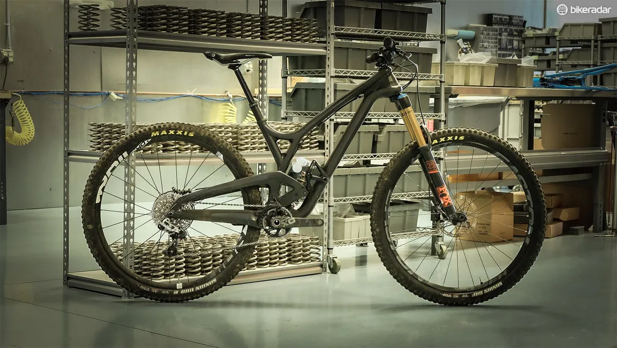
Compared to Ibis, Evil is the new kid on the block. Like Ibis, Evil places an emphasis on design. Evil, however, has a decidedly different genetic makeup.
“Ducati, Subaru and Epitaph Records, that’s the Evil soup, if you will. That’s the DNA of the brand,” says Evil’s president Kevin Walsh.
So a little top-end performance with an Italian flair, a healthy dose of rugged practicality, and a dash of punk rock go into every Evil frame.
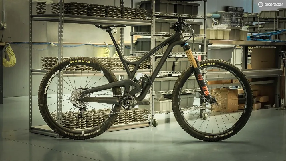
You don't need logos to know this bike is Evil
Like Ibis, Evil relies on the lines of its bikes to “sell” the brand, rather than color or logos. For Walsh, it’s about allowing riders to customize their bikes however they see fit.
“We put all our decals on top of the clear coat, so they can be removed. It’s about you; it’s not about us. We made this device for you to have a good time on and you should be able to customize it and have creativity with it.”
Ibis and Evil certainly aren’t the only two companies that have frames that can be easily identified just by their lines.
Think you’ve got a good eye for mountain bike design?
Take this quiz and see how many of these mountain bikes you can identify.
null