
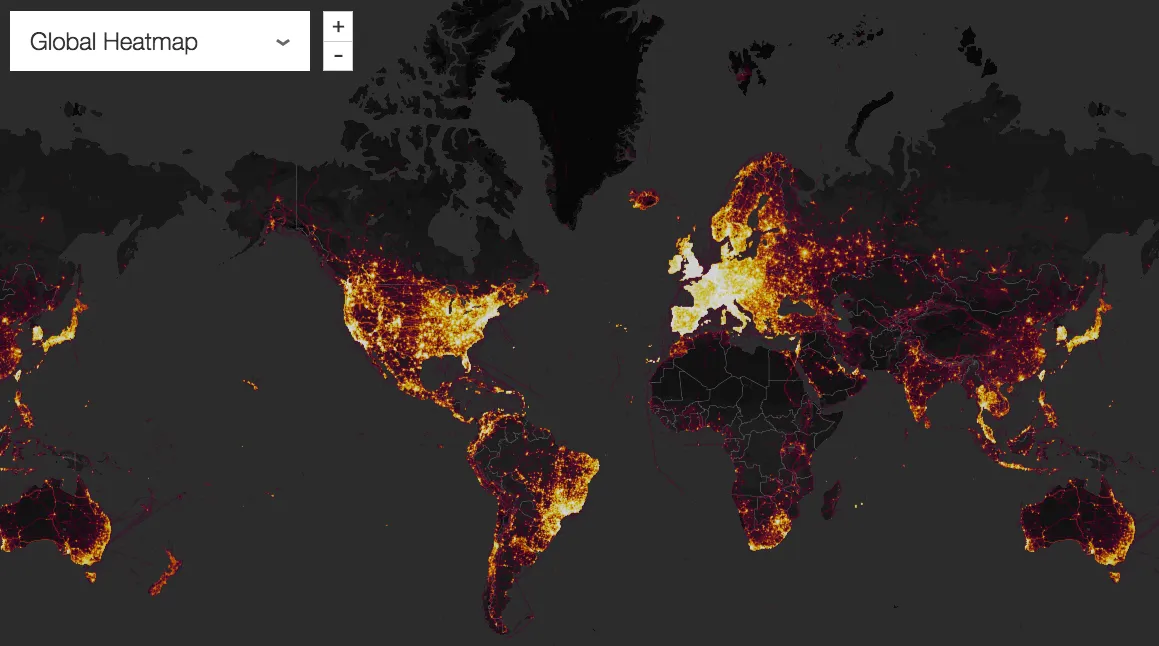

On the back of Strava flicking the switch on Athlete posts for everyone, the social network for athletes has also unveiled the latest update to its Global Heat Map.
- Strava launches Athlete Posts for the masses
- Strava tips: 20 of the best
- Is Strava Premium worth the premium?
The Global Heat Map is an interactive data visualization feature with more than 1 billion activities from across the globe, Strava say this updated version is based on six times more data than the original 2015 version.
Created in conjunction with Strava Metro, the heatmap highlights the routes that athletes are taking all over the world — the more popular the route the brighter it is on the map.
According to Strava, users have generated more than 200,000 years' worth of activity, covering nearly 17 billion miles.
“A global community can seem very abstract until you see its activities visually represented in your immediate location and across the world,” says Strava CEO James Quarles. “It’s not just runners and cyclists, either — skiers, hikers, kiteboarders and even mountaineers on Everest are all counted in more than a billion uploads from the Strava community.”
The new heatmap features data from 31 different sports, covering everything from riding and running to kayaking and ski touring. Whether it's trying to find the safest commute to work, or how to get avoid a dangerous bottleneck, the Heatmap shows you the routes other riders are taking.
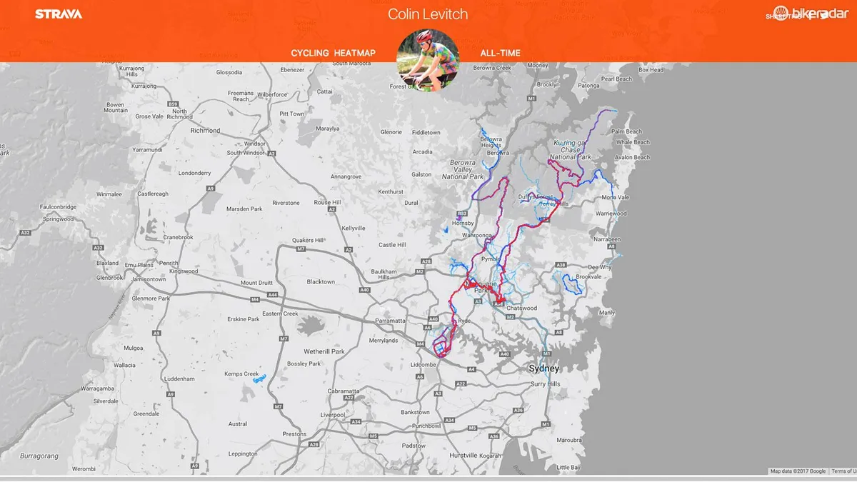
Strava Premium users can also access personal heatmaps, which Strava say is a unique way to visualise their activities over time.
Strava Metro then anonymizes and aggregates data from the millions of activities shared on Strava each week, and works with departments of transportation and city planning groups to improve infrastructure for bicyclists and pedestrians. A full set of Metro data enables deep analysis of activities, such as popular or avoided routes, peak commute times, intersection wait times, and origin/destination zones.
"The Strava Heatmap is enlightening because it lets us connect the bike riders we spot on the streets with a broader perspective of our territory, over space and time,” says Jorge G. Coelho, Mobility Project Manager, AMAL, Portugal. “Strava Metro then gives us the possibility to dive much deeper, breaking down data minute-by-minute and segment-by-segment for the entire road network. It's a bit like our Pasteis de Belém: they're good to smell, but you have to really sink your teeth into them to fully take advantage."
Check out the new Strava Global heat map here.
