


The hallmark of an iconic and successful design is one that is instantly recognizable without the need for labels. Rather than let the product speak for itself, however, bikes these days are adorned with an ever-increasing number of logos and feature call-outs that are neither necessary nor tasteful. Hey, bike industry, how about exercising a little visual restraint?
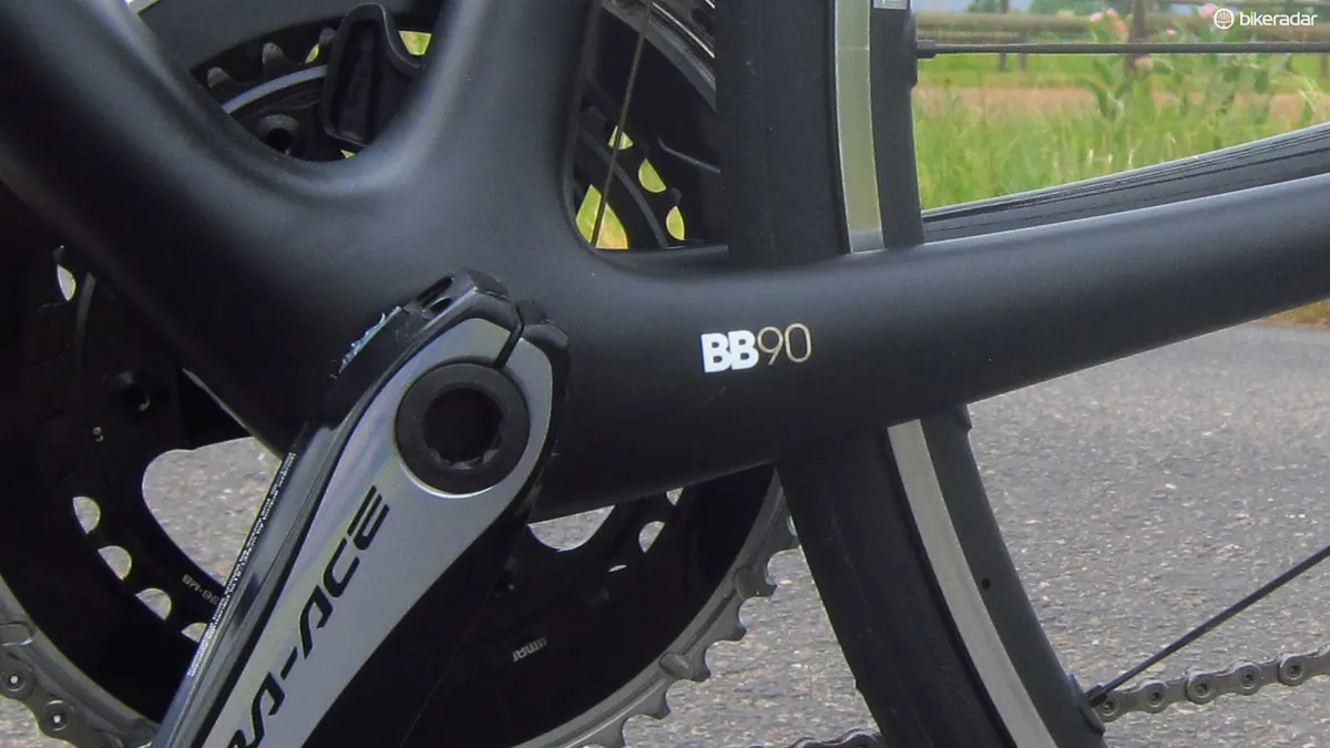
Nearly every test bike that rolls into the BikeRadar office is a veritable rolling laundry list of included ‘features’ printed on it.
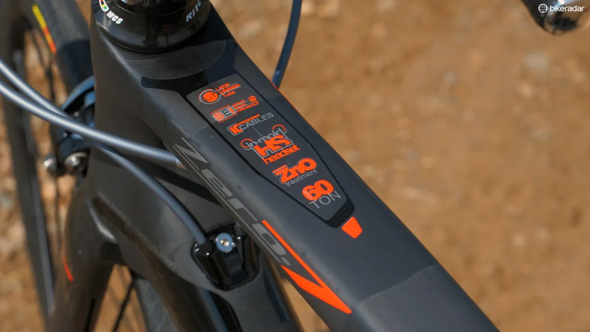
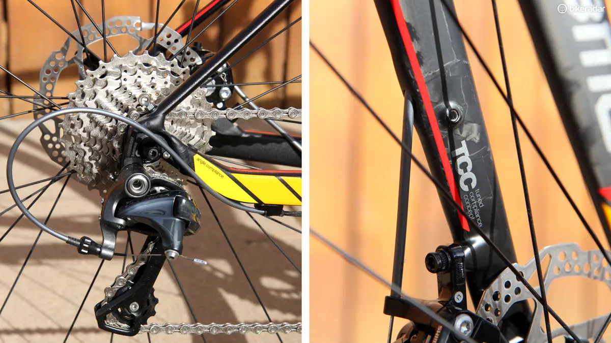
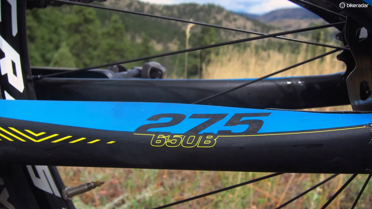
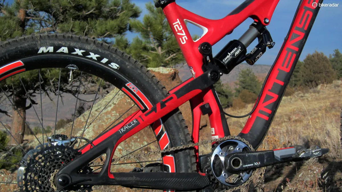
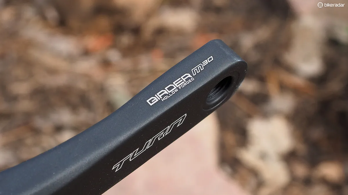
My Cannondale singlespeed has an annoyingly conspicuous “1.5 head tube” sticker on the top tube. GT places “27.5/650b” in big, bright letters on the chainstay of its Helion Carbon Pro. Scott’s carbon frames don’t just feature dropouts with a “Hollow Tubular Structure”; they use a “Scott Carbon Dropout System”. And of course, let’s not forget nearly every Wilier frame. Every time I saddled up on the Zero.7 I recently reviewed, I was rather loudly reminded that the frame was built with “Large Inflatable Tube, Special Elastic Infiltrated Film, Integrated Cables, In-Mold Headset, ZnO Treatment and 60-Ton carbon fiber.”
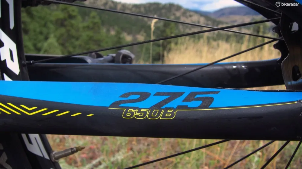
"Hey, nice bike. What size wheels are those?" "Why, they're 27.5/650B, as it says right here on my chainstay!!"
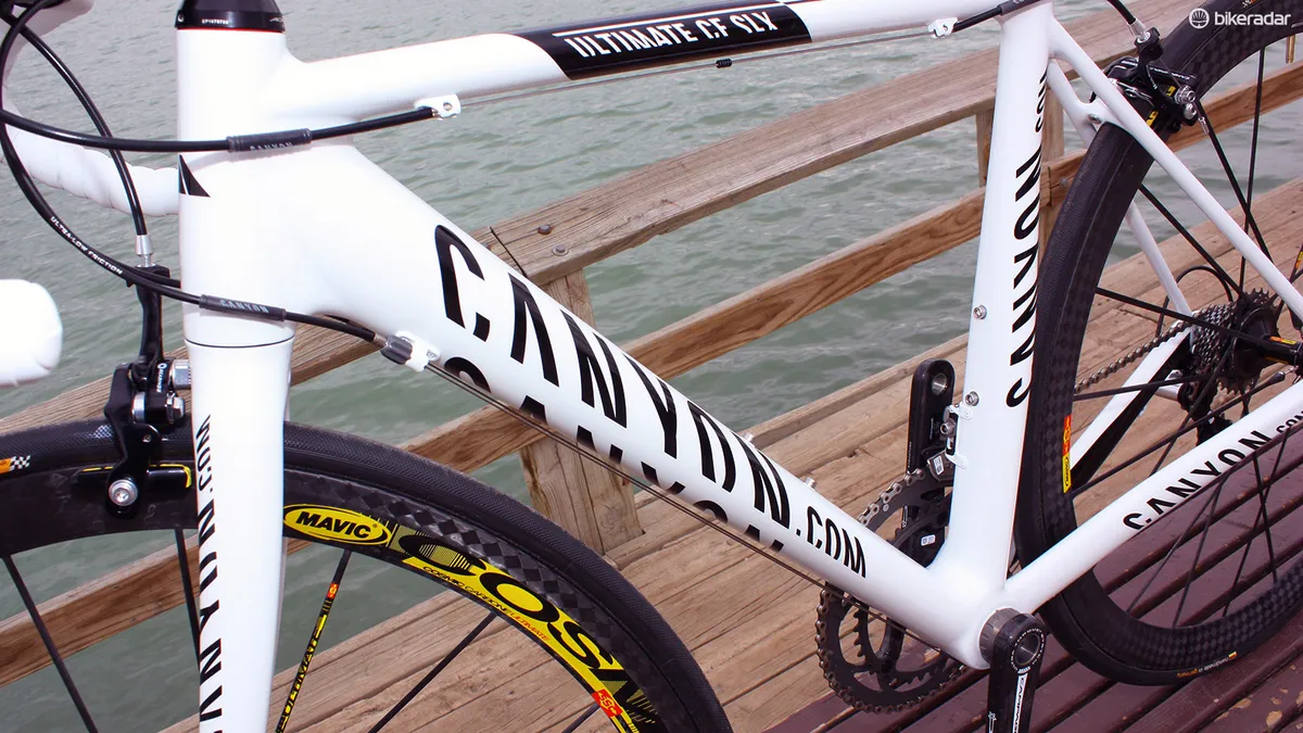
Some of those call-outs are also pretty ridiculous. Do we really need to be reminded of a bike’s wheel size? Or exactly how much suspension it has? Or that it’s made of super-mega-somuchbetterthanthatotherguy's-carbonfiber? Not long ago, Canyon’s down tube logo said “Canyon.com” to make it clear that the company was online-only – a practice that has thankfully since been abandoned. (As it turns out, Canyon wasn’t the only company to have a website. Go figure.)

Alright, we get it. It's apparently cool to have 27.5in wheels
And let’s not even get into the sheer number of brand decals on bikes these days. Rule of thumb: if there are more company logos on a frame than you have fingers to count them, you have too many.
Enough already.
I can appreciate that companies want to make sure potential buyers are made aware of the features that might very well set their bikes apart from someone else’s. That said, this is the sort of thing that should maybe only be on a hangtag or clipped-on card while the bike is on the showroom floor. It’s not something that needs to be – or should be – permanently emblazoned on the product itself, forever reminding its rider of things they should already know about.

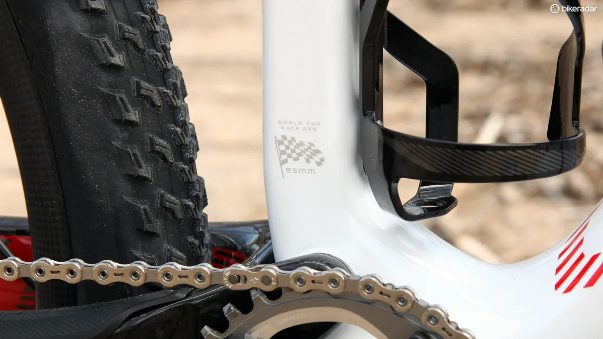
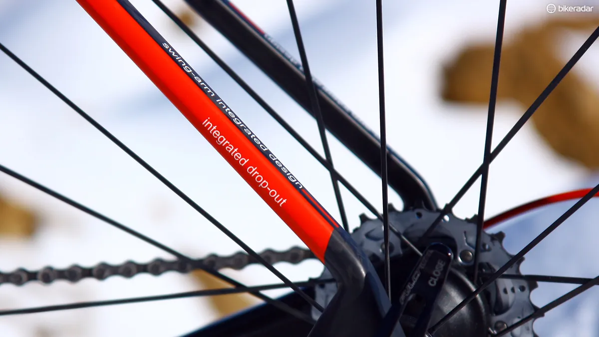
Because it's not enough to be integrated. You have to be really, really integrated
Just like that annoying person who constantly feels the need to tell everyone about themselves without asking, the fact that bike companies continually feel the need to slap egregious logos and features on their frames perhaps says more about their own insecurities than anything else.
If a product really is that good, show some confidence in it and let the performance speak for itself. Less is more.