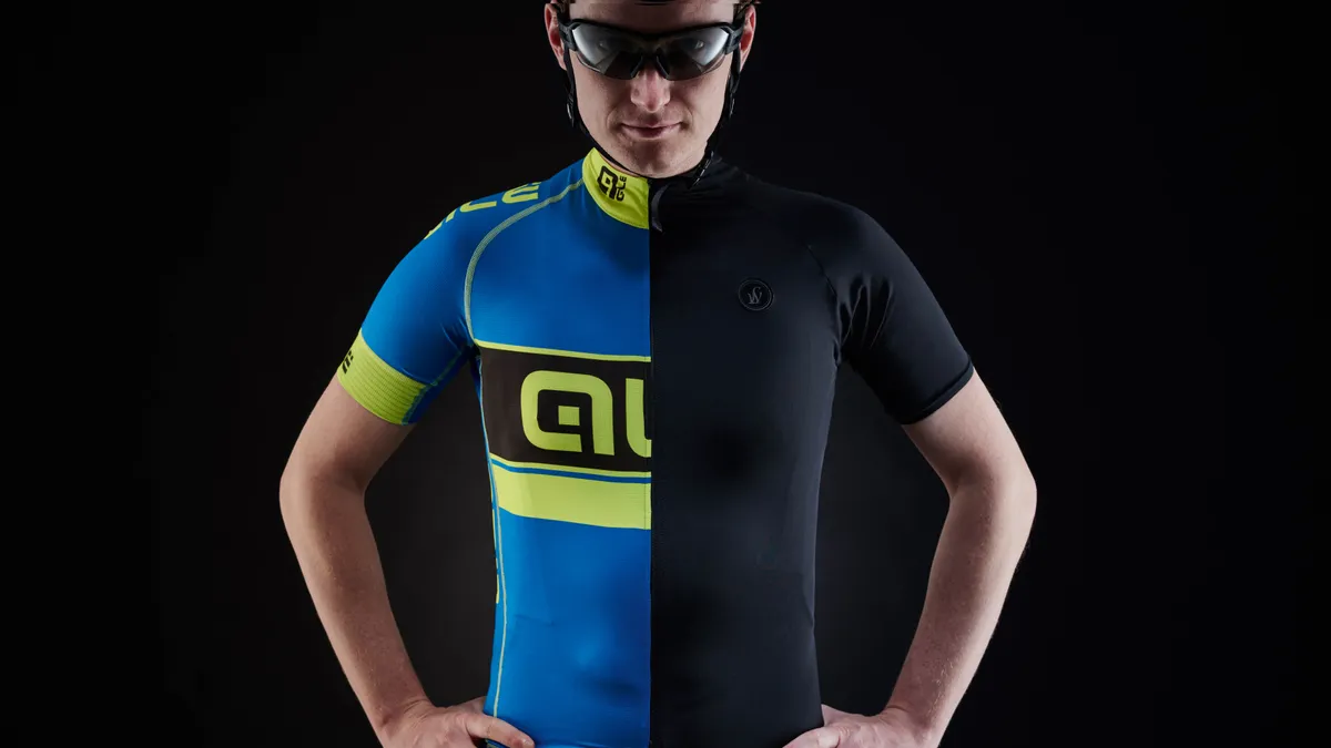

What is it about black? Season after season, brands from the mainstream to the cutting edge, pro-team kit designers, and keen amateurs stand in front of a rail of kit flicking through soft-shells, gilets and jerseys. They might admire the look-at-me red (a colour proven to enhance sporting performance in some studies), run a hand over the sleeve of a bright blue top… but then reach for the black one.
- What's the best bike for cycle commuting?
- 10 tips for safer city cycling
- Best bike clothing: all our guides in one place
Why is it that so many of us feel safe with black? Are the clichés about it being the most flattering colour true? Or is it simply a consequence of the ubiquity of this non-colour that makes us choose it time and again?
This year’s Team Sky kit by Rapha is, of course, predominantly black, and casting an eye over the peloton in recent years, any follower of the sport would have noticed that it seems to feature more dark colours than ever, perhaps a marketing response to the potential spin-off sales. Giant-Alpecin, Etixx-QuickStep, Trek-Segafredo, Bora-Argon and others also chose a dark base for their kit again in 2016.
It almost makes you wonder whether the corporate bods have briefed the design teams to: "pick any colour so long as it’s black." Whatever the truth, it’s hard to buy the marketing blurb that a strip of colour on a black background is the best way for riders to stand out in a road race, when the whole thing looks like a heaving monochrome mass.
Black's ninja image
Apparel designer Soudi Masouleh, who has worked on collections for everyone from sportswear giant Nike to Eddy Merckx, says that black is intrinsically cool. “We all associate black with expertise and seriousness as well as style and sobriety. Black has that ninja-ish image: it’s precise, understated and failsafe. And now that reflectiveclothing has moved on, all-black kit can be made to stand out just as much in the dark as brighter kit.
“The main point about reflectivity is that it needs to be strategically placed on the area that moves most — so that you can identify this with a moving body part,” says Masouleh. “On a cycling top it would be along the outer side of the arms and continuing down the back with flashes of reflection on the back.
“On leggings it would be outer sides of thighs, back of calves, outer side of the knees and side to back of ankles. We’ve come a long way from the time when a workman-style vest was the best option. There’s no reason to choose hi-vis brights over black now. It’s a question of what looks good, more than anything, and black always does.”
A spokesperson for Rapha’s design team seconds this, adding: “Black also has less obvious associations than other colours, which sometimes come with a lot of unconscious judgement. Whether it’s ‘look at me,’ or something more subtle but equally negative. Black is easy and everyone looks good in it.”
Interestingly, Masouleh says that the notion that black kit is the most flattering is misleading. “It isn’t slimming,” she says. “Black gives a sharp, defined outline, so if you’re overweight it will draw attention to your shape rather than detract from it.” However, she does concede that the light-absorbing properties of black do mean that it won’t draw attention to uneven skin tone. Although this depends on the fabric used, how matt it is, the opacity and thickness and so on.
The more conservative sex
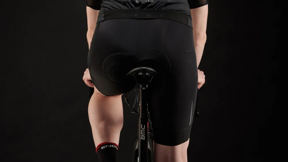
It’s not in the least surprising that men and women are most likely to opt for dark colours on their bottom half. Just check out the pictures (you probably have already, they’ve done the rounds on Facebook and email chains) from a few years ago of the Polish team in red shorts leaving little to the imagination.
Most of the brands we spoke to said that men were more conservative than women when it came to colour, with the overwhelming majority choosing dark over light, especially in winter. Shorts or leggings in black are less likely to draw attention to areas we’d rather the gaze of a stranger skimmed over. Nobody wants a shiny white area, or David Bowie-style spangly package on show – or at least, only the eccentric and extrovert few do. “Nobody wants to look clownish,” says Masouleh.
Black, charcoal and dark navy are also less likely to look revolting with muddy splashes on. They won’t stain, and don’t date in the way that coloured kit might, while dark bottoms pair well with brighter tops and jackets.
Expensive, tricky processes
Another explanation for the profusion of black is that for smaller brands, colours can be tricky. The technical fabric used in cycling kit sometimes only comes in black or white, so any colours will likely need to be sublimated afterwards: where heat-sensitive inks are used to transfer dye to the fabric so that the ink becomes part of the structure of the material. This is expensive and tricky.
With high-end kit, more subtle and unusual colours are becoming a hallmark of design quality. Ex-pro David Millar banned black from the colour palette when he was creating his Chapter III range with Castelli last year.
“I just don’t like black so much, I barely wear it off the bike and felt there were so many other colours we could use,” he says. “Even a very dark blue has a better effect than black in my opinion. Black has become somewhat ubiquitous in the cycling world,” he continues. “It’s almost bland. The idea of it being a rebellious colour in the cycling world, Johnny Cash-style, simply isn’t the case. Ashley Blue is more rebellious!”
Neither all-black, nor eye-popping
Even if you’re a fan of bright colours in your day-to-day wardrobe, eye-popping cycling kit can be off-putting. “It feels a bit much to wear colour head-to-toe on my bike,” says Lisa Buckingham from London, a keen amateur triathlete and fitness writer, who is a fan of brights when she’s not on her bike.
“I wear black shorts or tights and colour on top. I always think that coloured bottoms and a bright top is a bit like wearing double denim. I’d never wear all black on the bike. It might be that it’s slightly in my mind, but even with my lights on, I feel less visible if I’m wearing dark colours.”
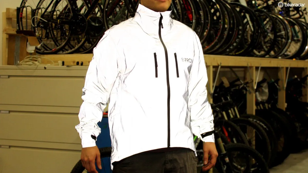
Buckingham is a Proviz convert, with its clothing made from technical fabric that is highly reflective: “The kit is gobsmackingly bright and I see other cyclists and runners wearing it all the time in London.”
High-vis reservations
Despite its ubiquity, we spoke to a couple of experts who were sceptical about Proviz. One critic, who preferred to remain anonymous, believes the silvery grey jacket that has become a bestseller and is popular with urban cyclists is actively dangerous because in daylight it renders you virtually invisible in the UK. “It’s the same colour as the London sky.”
Nick Hussey, founder and creative director of Vulpine, goes one step further, saying that he’s sceptical that there’s any point in wearing hi-vis in daylight in any case. “I’m a big believer in wearing what looks good,” he says. “The research on visibility is so mixed (apart from at night, when reflective kit and good lighting is a must). If someone isn’t going to see you, they won’t notice you whether you’re in a yellow jacket or a black one.”
Sir Chris Hoy, who has launched his HOY Vulpine collection with Vulpine, seconds this, saying that dark kit with clever reflective detailing is the key. He adds that when it’s designed well, black kit with good reflective detailing is better than old-school hi-vis. “A cyclist in one of those yellow hi-vis vests bent over their bike in a riding position won’t be seen — the stripe isn’t in the right place to catch car headlights, or other road-users’ attention. For our range, we focused on the positioning of reflective detailing relevant to the riding position.
“Detailing on accessories is also another great way to boost visibility. The backs of shoes, helmet and glasses, as well as backpacks, and lights and reflective detail on the bike itself, should all help ensure a rider is easy to spot,” he continues.
Contrast is key
Hussey is right about the evidence being contradictory. Visibility and safety is a fraught topic with considerable debate surrounding it. A study by the Transport Research Laboratory (TRL), part of the UK Department for Transport, which looks at all aspects of transport safety and functionality found that when it came to collisions between motorcycles and other vehicles, head to toe hi-vis had little or no impact in ‘SMIDSY’ collisions – those cases of: 'Sorry, mate. I didn’t see you.’
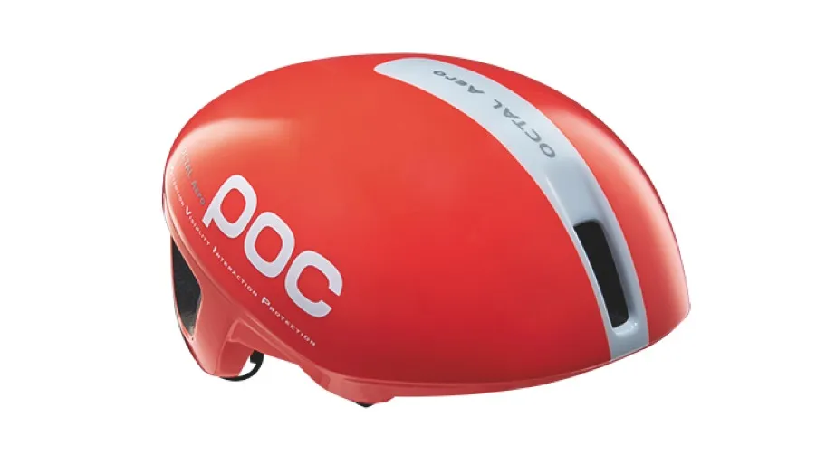
Another recent study, again into motorcyclist visibility on the road, appeared to show that drivers saw moving motorbikes more quickly if there was a greater colour contrast between the background and the rider’s clothes. This was backed up in research carried out by the Swedish cycling brand POC, which found that although fluorescent clothing made riders more visible, there was a crucial difference between being seen and being recognised.
We asked them to explain the difference. “First off, it’s not true to say that bright colours don’t help with visibility,” says Oscar Huss, head of product development at POC. “A conventional bright colour is able to reflect about 90 percent of a colour present in the visible spectrum. Fluorescent colours can reflect as much as 200 to 300 percent by using a larger amount of the visible spectrum, and by re-radiating some of the absorbed ultraviolet rays and colours in the lower part of the visible spectrum they can then be seen by the human eye.
“This ultimately results in the eye perceiving a more intense colour. On the road, the advantage of this is that it increases the distance from which an object is seen, and some studies show that fluorescent clothing is five-and-a-half times more visible than conventional clothing.”
POC’s AVIP system (Attention, Visibility, Interaction, Protection) uses a combination of orange, white and navy/black. “Visibility is all about contrast and changing conditions,” continues Huss. “There are basically two types of contrast, which can be explained by the prominence of a colour compared to its background and the difference in a colour to adjacent colours — i.e. colour intensity and difference. So the combination of orange with a monochrome palette ensures the bright jumps out, but the black and white provide contrast too, especially when placed in more varied environments.”
The important definition here is the difference between motorists seeing cyclists and recognising them. Visibility depends on the quality of daylight/streetlight and background environment. Backing this up, at its most surprising, this means that sometimes a black jacket may be the best option for visibility in an urban environment — a 2012 study by the Transport Research Laboratory concluded that, unlikely as it sounds, black or white sometimes offered more of a stark contrast than bright colours on busy city roads.
Take your pick — but make it reflective
The consensus seems to be to wear what you like, but make sure it’s reflective. Even considering this advice, an analysis of accidents involving cyclists found that despite the fact that most of them happen in low-light conditions, dark clothing was reported to have been considered a factor in only 2.5 percent of incidents according to police feedback.
One word of caution: stick to the dark shorts and step away from brights and lights on your bottom half. Unless you want to end up as a viral Facebook share with an: ‘anyone seen my ferret’ caption.
This article was originally published in Cycling Plus magazine, available on Apple Newsstand and Zinio.