

Chpt. III x Castelli is a unique collaboration between recently retired British pro David Millar and Italian cycling apparel brand Castelli. It’s a bid to create the ultimate cycling gear for discerning cyclists who aren’t seeking high-intensity performance, but desire sartorial elegance while on the bike and to be the best dressed rider at any espresso stop.
The origins
The name, Chpt. III, represents the third era of Millar’s cycling career and is a project that’s come to fruition after 18 months of hard work between Millar, designer Richard Pearce – who worked on Millar’s Fizik shoe project in 2014 – and Castelli’s Steven Smith.
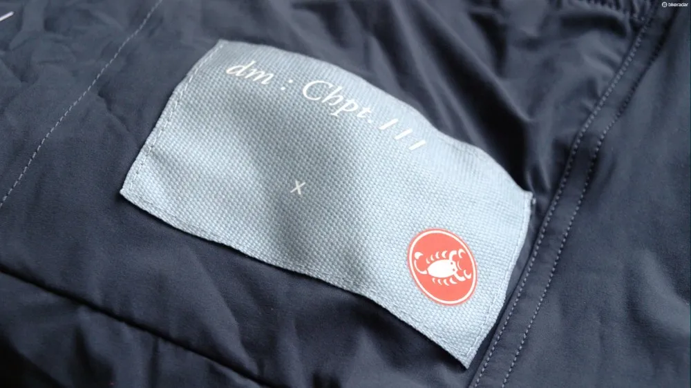
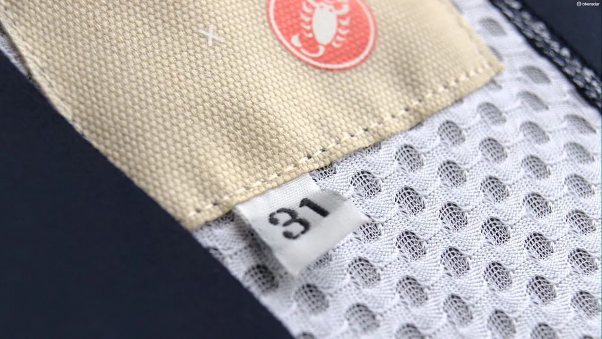
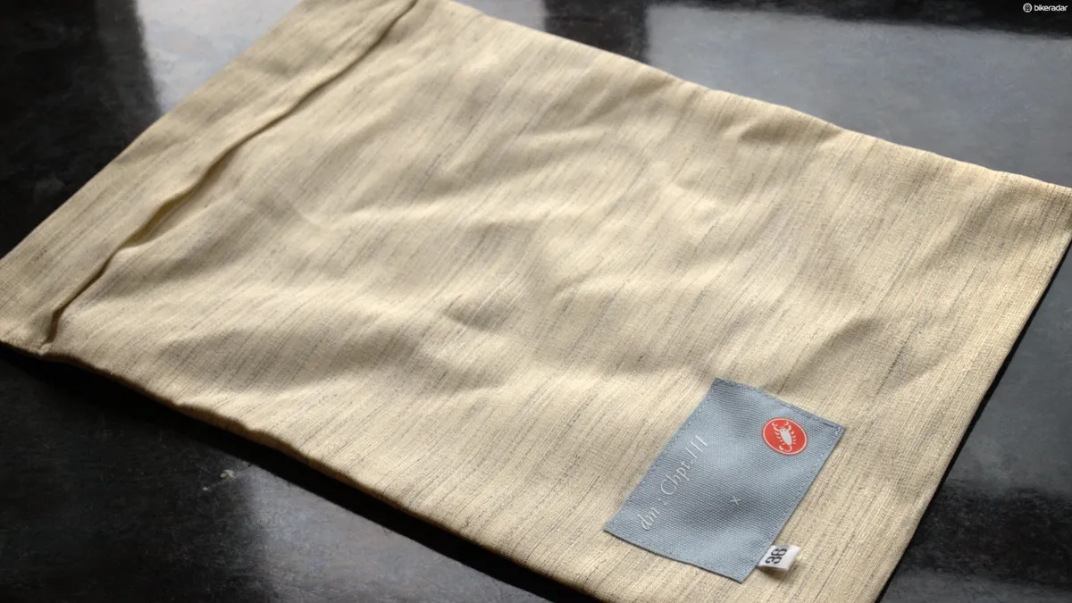
The full name is dm : Chpt. III x Castelli, but 'Chapter three' trips off the tongue a little more easily
Millar’s relationship with Castelli goes much further back though. The rider has been giving direct feedback and informing the design of the brand’s pro-level gear since 2007, no doubt contributing to the place Castelli now holds in the uppermost echelons of cycling apparel.
"By coincidence or destiny, we started our own comeback Chapter with David at Saunier Duval in 2007 and then joined up again for his last four years," says Smith. "At some unremarkable race hotel the seeds were sown for a new creative collaboration."
So when it came time for Millar to face life after a career “dressed as a human billboard,” the rider didn’t want to have to wear kit designed by someone else. “I wanted to create cycling clothing that was constructed for my new life as a non-racer, only designed for riding, not racing, but still with the latest tech and with a collaboration that I’d always known.”
The ethos
Millar’s own creativity has been combined with Castelli’s materials and manufacturing expertise and Pearce’s flair for design.
“I started to think about David’s career as a narrative,” says Pearce. “Like a play with the classic three act structure – and then I started thinking about it more like a book.”
In that narrative, chapter one is Millar’s professional beginnings and doping, which ended in destruction; chapter two, rebirth, redemption and closure; and chapter three – beyond retirement.
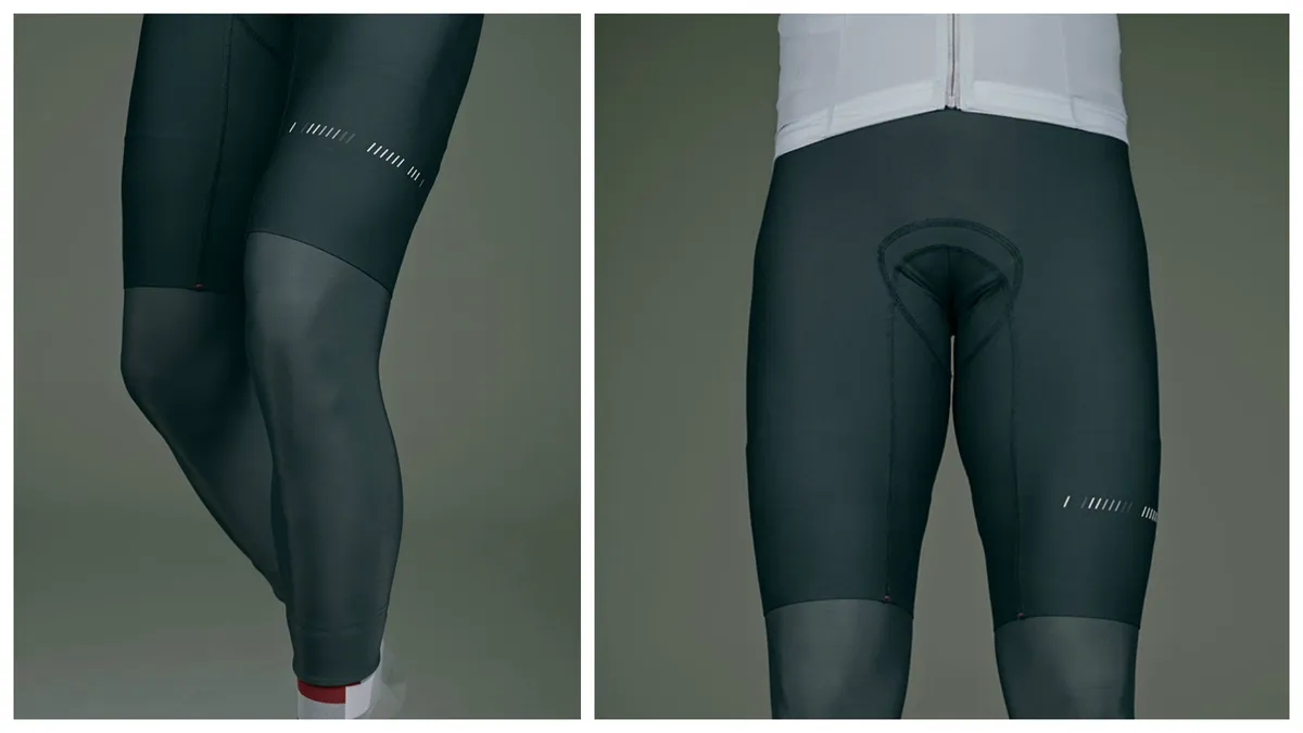
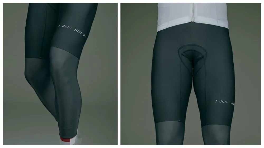
The motif that runs around the legs of the bibs and sleeves of the jersey features one forward slash per year. Among the white, three grey lines represent Millar’s years as a doper and a black pair his ban from the sport. The final fiery red (Rosso Fuoco) line brings us up to date; collection one of chapter three – a new beginning without forgetting what’s gone before.
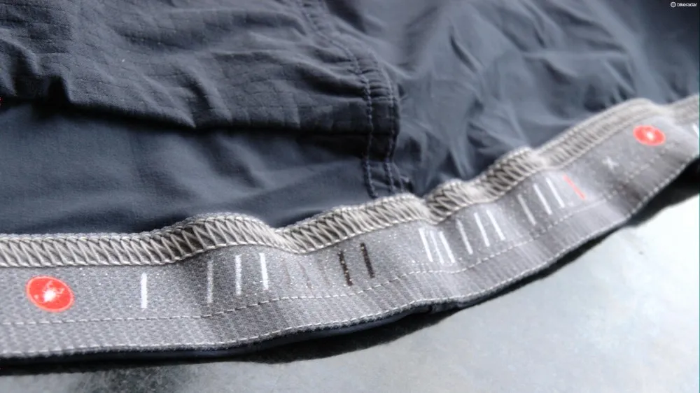
This slash motif is seen across the whole collection, being a shorthand summary of Millar's career on the bike
“I didn’t want my name on it, because I’m a bit like Marmite,” says Millar. However, Pearce adds that using the rider’s name would have immediately aligned the brand with that of other professionals. “Straight away it puts you in that cycling group along with Cav and Chris Boardman and Vicky Pendleton. Everyone’s got their own brand with their name on it and we didn’t want to be in that area.”
Instead, Chpt. III concentrates on male cyclists with an appreciation of fashion; those who want to be comfortable and impeccably attired – a group, in short, that represents a relatively new breed in cycling.
“I think it’s very much thanks to Rapha and what Simon Mottram’s done in creating a new demographic and Anglo-Saxon interest in the sport,” says Millar. “I think there’s a new niche area within that to move into. So that’s in many ways what this is all about creating: a brand that works for men. Not just in a cycling way, but hopefully in other areas as well, moving into all sorts of things with that same ethos.”
The design
With Millar’s reputation for being eternally well turned out, it’s little surprise that the Chpt. III designs take their greatest inspiration from tailoring. Described by Millar as “the cutting edge of fashion,” the Chpt. III team even consulted with renowned tailor Timothy Everest to perfect the lines and cut. The muted hues reflect the Savile Row sensibility with brighter shades featuring as accents and lining.
Pearce points to the satisfying symmetry of the project with Castelli’s earliest history. “When you trace Castelli right back to the beginning – 1876 – and the fine tailor Vittore Gianni set up in Milan…all the kits back then were absolutely handmade. Fausto Coppi always wore Vittore Gianni. There’s a beautiful connection with what we’re doing now, it’s authentic because Castelli come from tailoring roots.”

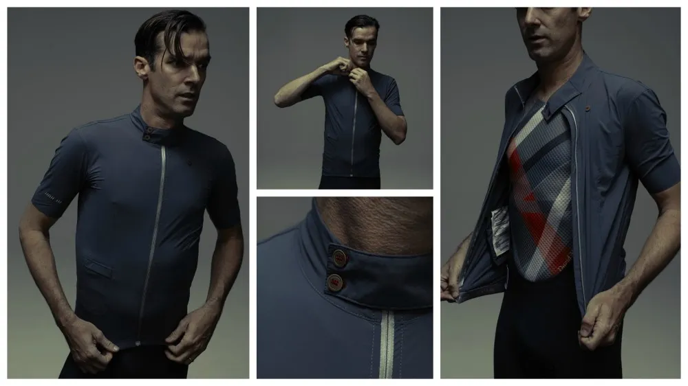
The buttons are designed to reflect the brand name
Castelli’s focus with Chpt. III has been in developing the latest production techniques to take those elements of bespoke suit design – such as darts and pleats – and create garments in the latest technical fabrics. “The construction is amazing,” says Pearce. “It’s all darted, all the seams are taped. It’s almost as beautiful on the inside as the outside.”
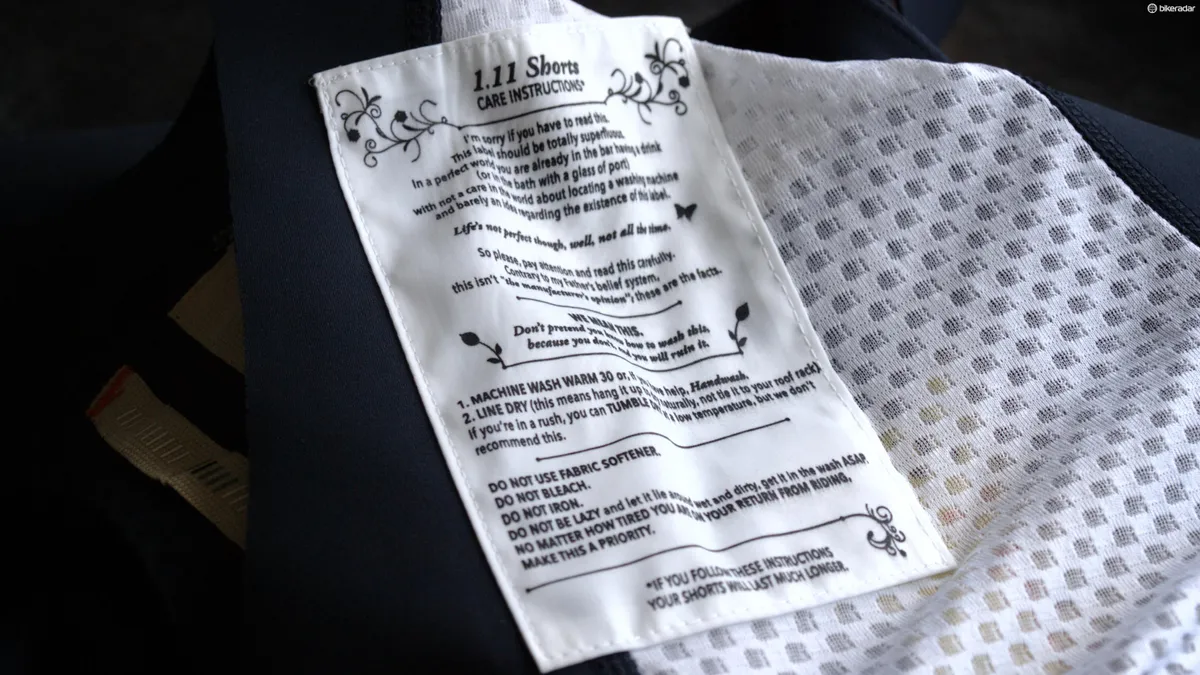
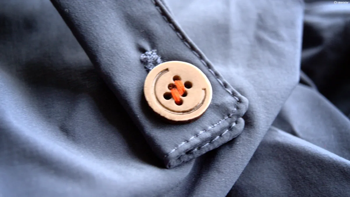
Attention to detail is present throughout the first range, from that autobiographical slash motif to the washing instructions penned by Millar himself: “Contrary to my Father’s belief system, this isn’t ‘the manufacturer’s opinion’; these are the facts.” Nowhere is this eye for detail clearer than the buttons, which feature six holes surrounded by a large ‘C’ to represent the brand’s name.

Millar wrote the care instructions himself
The considered design will please even the most demanding Rapha fan while Millar’s obvious sincerity and enthusiasm for the project (and those washing instructions) may well validate the range’s stylish excess and unashamed indulgence in the eyes of less pretentious roadies.
“We want everything to be more upper end rather than featuring mountains in black and white and people crying. We’re a bit more poncey, in a nutshell,” says Millar with a grin.
Fabrics and performance
“After 18 years as a pro, David’s been accustomed to the very best tech, so he didn’t want to downgrade from that,” says Pearce. “Essentially, he no longer needs the marginal gains of climber’s jerseys or skin suits. But we didn’t want to take a step down on the quality.”
Rather than stepping down, Chpt. III actually represents the cutting edge of Castelli’s cycling apparel design with regards to materials. Just as you can now buy a ‘better’ bike than the professionals are allowed, Castelli used fabrics that the pros can’t have due to them needing sublimated printing for sponsors’ designs.
“We couldn’t do this jersey for a pro because we wouldn’t be able be able to put on what the sponsors would’ve wanted,” says Smith. “So the mere fact that we can go much more stealth meant we could use this fabric [for the jersey], which you can’t print on. It’s 50g per square metre – that’s a third lighter than the lightest fabrics being used in the Tour de France.”
“We’ve taken all those compromises you have to make with race kit and added into it a lot more of these tailored, sartorial elements,” said Pearce. “So that’s the essence of the collection.”
Collection 01 range
The Chpt. III x Castelli range will be available soon from (very) selected in-store retailers, including Bespoke Cycling in London, as well as through Mr Porter. The jersey comes in at an eye watering £190. Full prices are yet to be confirmed, though it’s a fair bet that if you have to ask, you can’t afford it.
BikeRadar was invited to the utterly lavish launch of the collection, which featured a ride out in the kit from at Bespoke Cycling’s Jermyn Street store in central London, followed by a fittingly posh and apt product launch and meal at Sartoria on Savile Row.
1.11 Short
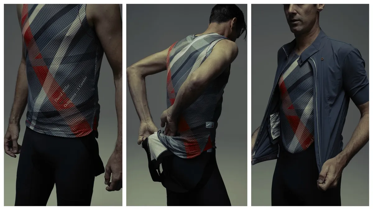
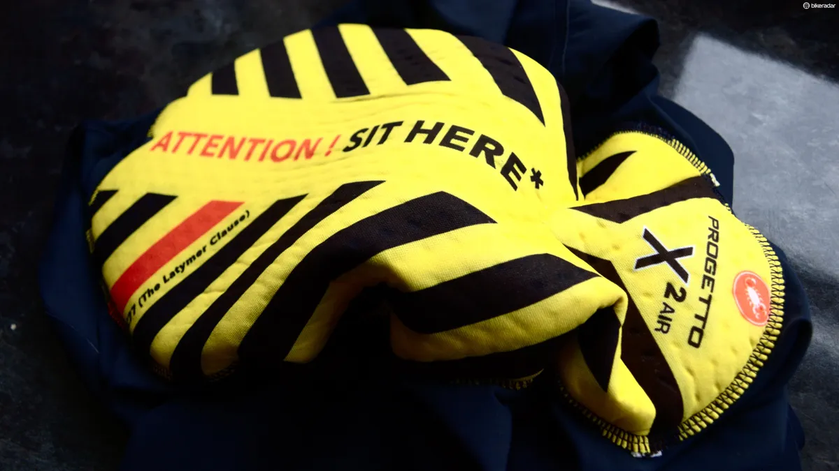
The bib shorts use the Castelli’s pro-level Progetto X2 Air pad, which gets a printed design to remind you it goes on the inside of the short – a tribute to one of Millar’s friends who misunderstood the correct chamois / buttocks relationship when taking up the sport.
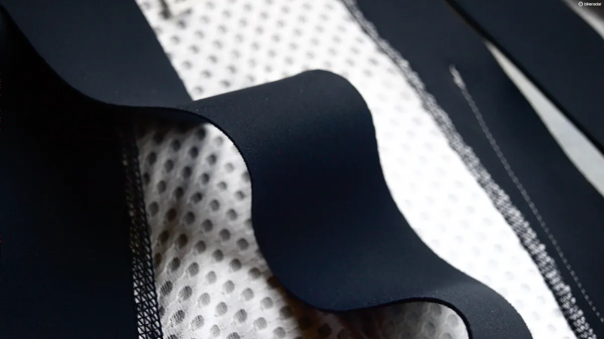
Like Castelli's Body Paint designs (Millar still owns those prototypes), the shorts are created with one seamless piece of Lycra rather than panels for luxurious comfort. The straps are designed to be like braces, being wide bands of elasticated material that are incredibly comfortable. In fact, aside from the mesh back section, all the material in the shorts is so utterly smooth that one struggles not to constantly stroke it. It’s a tangible reminder of the kit’s high-end nature.
“We used the highest quality Lycra, which is why it feels so good,” says Millar. “It almost feels like compression. A lot of guys wouldn’t use that for racing because it gets too hot, but you’re not going to be going max effort in these.”
Millar’s washing instructions are sewn into a panel on the back, which can also be used as a storage pocket – though surely not for a race radio.
In keeping with the tailoring vibe, the shorts are sized in inches as with trousers, which might sound a little over the top, but has to be by far the most reasonable sizing system for Italian gear, which is often a long way from kit from other regions. The shorts are available in two colourways – Ivy Green and Outer Space Blue.
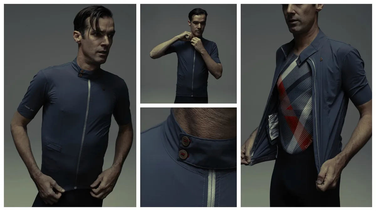
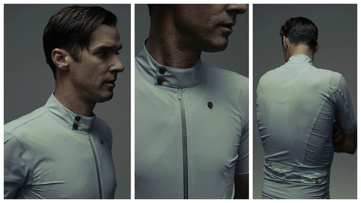
1.21 Jersey
As mentioned already, the jersey is ludicrously light with wafer-thin fabric that has loads of stretch for comfort. Like the shorts, it’s suit sizing here. The jersey features a skin-hugging athletic fit – apparently Millar has no intention of allowing the literally widespread post-career weight gain to take hold. There’s no riding up or bunching, just 'forget it’s there' comfort.
The full-length zip is topped with a button-over storm flap that can be secured at another button at the collarbone when not needed. “You can stop and button up the collar,” says Millar. “Some people might say, ‘Well, how am I supposed to do that while I’m moving?’ It’s like: you’re not racing – stop.”
The front is darted and shoulders squarer for a more shirt-like look. There's an enveloped pocket on the right of the abdominal area that's ideal for a credit card or a smaller fruit-based phone device. Three pockets adorn the rear, the central one being just the right size to house a rolled-up Rocka jacket (see below). All are reinforced to cope with being stuffed full. There are also two interior pockets, specifically designed to stow accessories.
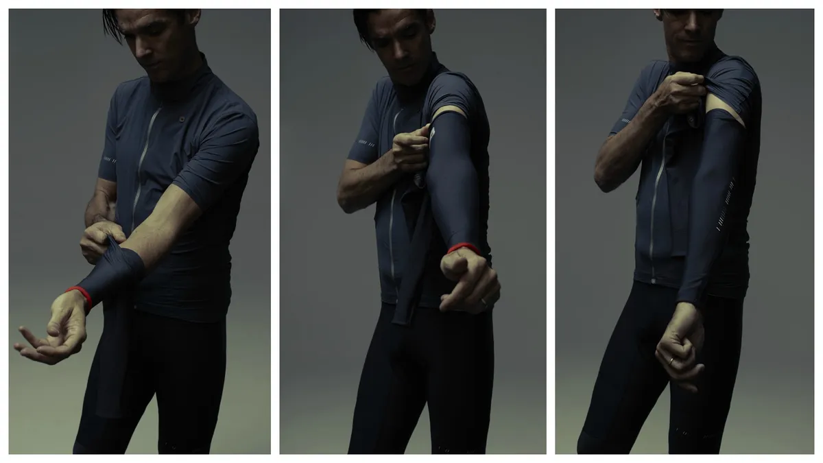
“It was designed as a full set of kit for me as a retired pro that will get me through most riding conditions – spring, summer and autumn,” says Millar. “When we’re racing, we take off our arm warmers and put them up our jersey. So we’ve put these interior netted pockets on the inside the jersey so you can fold your arm warmers in half and knee warmers in half and they’ll fit inside. Nobody’s done that before, I’ve never seen a jersey like it.”
The Jersey is available in either Ashley Blue or Outer Space Grey.
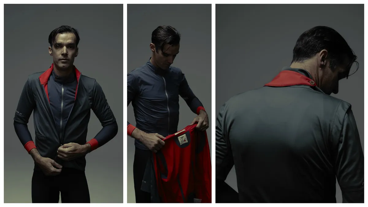
1.61 The Rocka

Taking its cues from Millar’s favourite racing garment, Castelli’s popular Gabba all-weather jersey, the Rocka is designed to be elegant, practical and protective. “The Gabba was essentially designed as race kit,” says Pearce. “So you take it off and throw it in the team car – but most people don’t have that luxury of the team car! We worked with Gore over the last year to come up with a fabric that gives the same performance of the Gabba, but has nearly 30 per cent less volume. You can actually put it in your back pocket.”
Once it’s being worn, the Rocka’s enveloped rear pocket is sized to slip inside that of the jersey – another example of how considered the design of the collection is as a whole.
The shoulders of the Rocka are pleated, giving a shooting-jacket style look and sharper silhouette, while the fiery red lining gives a shock of brightness that’s matched by the turn-ups on the arm warmers. It’s also got the darted lines on the front to help with that all-important shaping.
The front-pocket is larger than the jersey’s and is suitable for bigger smartphones. There’s also a larger storm flap than that seen on the jersey, which Everest helped shape and buttons around the rear of the neck when not in use. While not water resistant, the Rocka is water repellent, windproof, and breathable, so able to cope with all but the most extreme conditions.
1.81 Base Layer

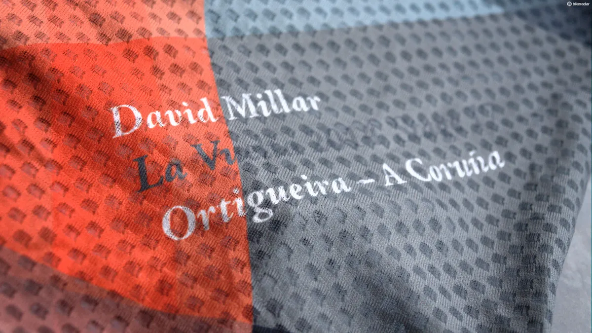
The base layer is designed to be like a bespoke suit lining – brighter and with more personality. In tailoring, it’s called the reveal and in fact, it’s very much a reflection of Millar. Pearce took the rider’s SRM and Garmin data from Stage 17 of the 2014 Vuelta and interpreted this into a unique parametric design with reds relating to altitude, black to cadence and so on. It’s a similar thinking to Rapha’s Data Print design.
The base layer has a lower neck to compensate for the higher neck lines of the jersey and Rocka. If you combine the base layer with the jersey, it equals the same weight as a regular jersey, though with the added benefit of improved moisture transfer thanks to a hydrophilic outer layer that wicks perspiration off the skin to the jersey, but doesn't absorb moisture along the way.
Knee warmers, arm warmers and socks
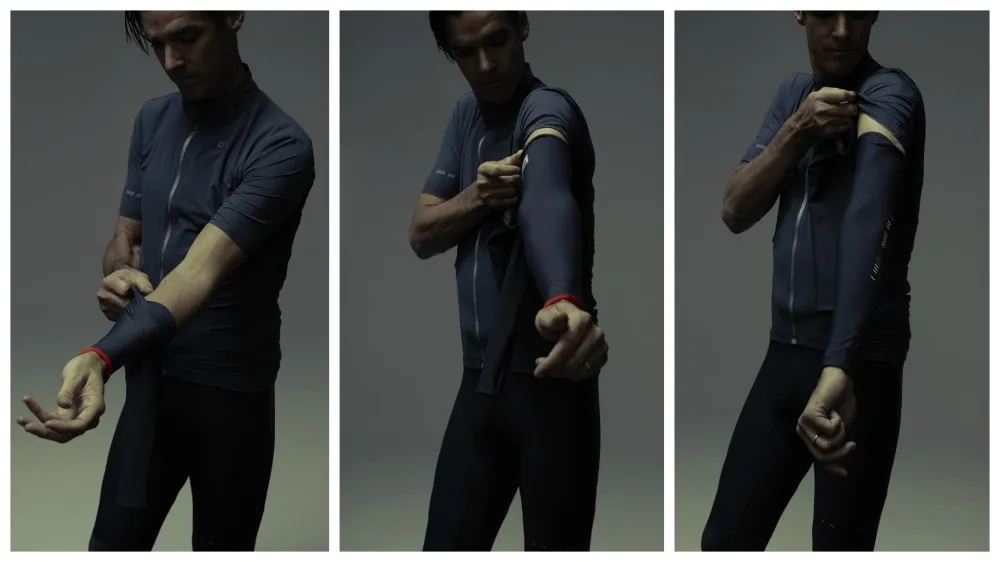
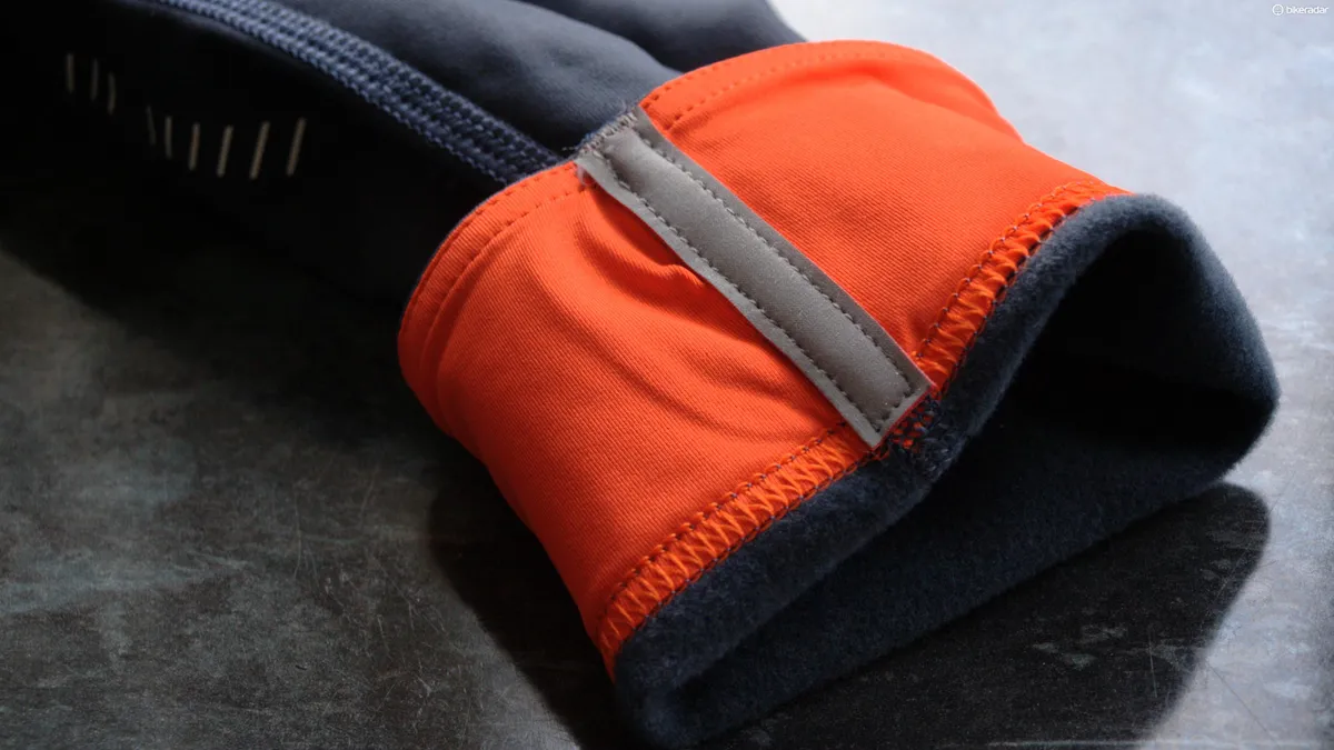
The knee and leg warmers are designed to offer a balance in terms of length between most knee warmers, which Millar finds too short, and full-length leg warmers. These, along with the arm warmers are made from Castelli's close-knit, fleecy and stretchy Thermoflex fabric, said to be a step-up from the oft-used Roubaix type.
The warmers are coloured to sit in harmony with both the short and jersey colourways. They do however feature turn-ups that reveal that Rosso Fuoco colouring as well as reflective strips.
Millar's notes on the warmers state: "If you take them off during the ride (please stop, we only do it while rolling as professionals because the risk of crashing seems more attractive than stopping at the side of the road and watching the race disappear, plus we’re on closed roads, and have team mates to push us) fold each flat and place one in each of the interior warmer pockets on the 1.21, folding them as flat as possible makes them much comfier to carry and less obtrusive on the exterior pockets."
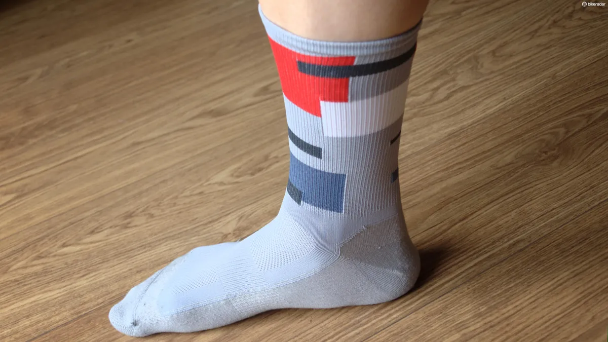
Socks

As with the rest of the collection, there's a narrative to the socks. In this case, Millar received exactly the same type of sock as a promotional freebie from a sponsor during his human billboard days and quickly came to view them as the best socks he'd ever used.
"When it came to the subject of Chpt. III socks I told Steve Smith of Castelli, 'I have the best socks in the world, but I don’t know where they are from.” So the search began, Steve and I gave our email correspondence the subject title: TBSITW (The Best Socks In The World), I couriered one of my last pairs to Italy to be studied by Laura in R&D at Castelli.
"Steve ultimately tracked them down to a factory in Northern Italy, the owner had died, his brother had taken over, they no longer made the socks. Steve made them make the sock again. 1.93 is the fruit of the quest for TBSITW."
The footbed is made with ceramic thread (Millar admits he doesn't know what this does) and they're quite long, which is the rider's preference. They're also suitable for off the bike use. The design is that of a code, or key to the data used on the baselayer – time, speed, watts, distance, cadence and heart rate – mirroring the colour choices on that garment and reminiscent of the Ben Nicholson painting that Pearce spotted during the design process.
The collection is undoubtedly ambitious, luxurious and unashamedly high end. The brand will surely court a loyal following of riders searching for exclusivity and a talking point on those all-important coffee-stop rides. It'll be very interesting to see how Chpt. III grows – there are additions to the range already planned. While we can't imagine seeing throngs of cyclists in Chpt. III kit, that's probably all part of the plan.
Check out the gallery above for more images and find out more at chpt3.com